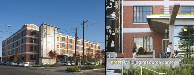
Step inside the City of Houston Permitting Center on Washington Avenue and you enter a representation of the city’s dedication and commitment to its citizens, employees, their education and their future. From its location and use of space, energy efficiency and aesthetic appeal: this building was truly created with its users in mind. This week, we talked with Bill Neuhaus, FAIA, LEED, AP of Studio RED Architects, about the design and planning process for the newly opened City of Houston Central Permitting Center.
What function did the client need this building to serve?
The City determined the building which housed the majority of Building Code Enforcement activities was too small, not energy efficient, with minimal amenities for customers and employees. Other permitting activities were housed in multiple locations so customers seeking permits often had to drive from location to location.
The new Washington Ave. permitting center houses the majority of the City of Houston’s permitting activities in one location. The city’s goal was to create a user-friendly central permitting building, using retail principals to greet applicants and provide a welcoming environment. All departments were to be housed in one building and for the first time, 90 percent of the permits necessary to do business in the city would be available under one roof. To speed the process, accounting was centralized, modeled after retail sales and inventory systems. The building would also house the Green Building Resource Center, an educational “shop-and-learn” environment.

Why did the City of Houston choose to renovate/rehabilitate an old building over new construction?
Andrew Icken, from the City of Houston, came to us with the question of whether it would be more financially efficient for the city to purchase and reuse an old building he had seen, or engage in a new construction project on their previous lot. Our analysis and comparison of the old warehouse and of new construction on their existing site indicated that a rehabilitation would come out to about 75 percent of the cost of starting from scratch.
A five-story 1920’s rice warehouse was acquired to house the disparate departments and the city’s Green Resource Center. The design team’s analysis showed the 180,000 sf building could house most permitting activities, and that its adaptive reuse would anchor the East end of the redeveloping Washington Corridor. One favorable factor for the reuse project was also the ability to use existing shaded parking lot under the HOV lane one block from the site. This lot provided sufficient parking for employees, eliminating the need to construct another parking garage in Houston.
The reuse of the building provided the opportunity to expose construction techniques, organize efficiently on a 37,000 square foot floor plate and embrace the city’s Civic Art Program, providing art for citizens in a way not seen since the WPA. All of this was accomplished in a building tracking LEED Gold. (The city requires all buildings be LEED Certified, anything with a ten year or less payback is reviewed.) The result is a building with exposed brick walls, hot riveted steel, a vegetated roof irrigated with condensate, frictionless air handlers and raised floor.

How did you test your design and materials for a reliable ‘measurement’ of sustainability?
Our design team analyzed the existing structure of the warehouse to determine the most efficient strategy for conversion. The analysis recognized the beauty of the building’s existing materials and existing conditions, which were utilized if supported by energy modeling studies.
Through this analysis the team was able to justify High Efficiency “Frictionless” HVAC units and under floor air. This allowed the team to locate all major wiring and cabling under the floor, drilling down to install lights, tailored to daylight conditions, as well as cameras and fire detection equipment eliminating the clutter of exposed conduit and maintaining future flexibility. Energy modeling of the exterior masonry triple wythe walls defied logic, illustrating new thermally broken windows were more beneficial than wall insulation. To the delight of the design team, this allowed the exterior walls to be exposed and breathe as originally designed.

What changes were made to the existing building in this renovation/reuse?
An interior freight elevator was removed, providing a light shaft and communicating stair to connect the previous departments. Though the shaft didn’t provide access to the roof before the renovation, these new stairs now lead up to the rooftop, where small groups can be taken to observe the building’s solar panel and future wind turbine additions.
The warehouse’s old loading docks were retrofitted for a clip-on lobby and “racetrack,” a 30- station desk facilitating transactions. The lobby brings light into the space and adds a modern, clean look to the building’s facade with its covered entries.

Original internal stairs weren’t up to code, so they were eliminated in favor of external stairs that were also fitted with signage for the building. We pulled stairs outside the building, made them code compliant, made them signage, Houston Permitting Center.
The exterior elevator tower was also replaced, which ended up being more cost effective than rehabilitating it. This tower is visible from the freeway, and its stainless steel wrap served as the canvas for an iconic piece of public art created by the late artist and former architect, Dick Wray.
The building anchors the East end of the Washington Corridor redevelopment and is adjacent to the Houston Amtrak Station, the logical home for future heavy rail service in Houston. The aesthetics of the clip on lobby, attached to the old loading docks, provide views into the existing warehouse structure and create a lobby reminiscent of the adjacent train station. This lobby celebrates the retail intent of the building with the Green Resource Center’s display area open to all, attracting those waiting to visit permitting to a sustainable educational display.

Why are we able to see so much art from the community in this building?
Houston has a mandatory 1.75% of total costs set aside for civic art. The Houston Arts Alliance conducted interviews and selected a local artist, Mary Margaret Hansen, to manage the program; a team member who shared the vision of a highly functional, cost effective facility that would be radically different from the usual municipal building. Joining the collaborative design team early on allowed the team to identify opportunities for “artful interventions.”
[Read Hansen’s blog here]
Local artists were asked to participate in the project by creating new pieces to install throughout the building. The pieces range from sculpted metalwork consisting of recycled materials to colorful murals. The artwork also symbolizes the city’s commitment to sustainability, the civic realm, and represents the community’s contribution to the completion of the project. Hansen created a blog to document the development of the civic art exhibits in the permitting center, for the public to follow here.

Are the building’s patrons happy with the result?
The building met and exceeded all expectations, largely because this process has been so collaborative. Permitting functions for different departments are now co-located ,allowing for shared common functions such as cashiering, printing, reception, customer service representatives, etc. It is a truly civic building filled with local art of all types and sustainable features like the vegetative roof that are sure to spark more green movements in Houston. More importantly, though, it is an efficiently designed workspace and a comfortable facility for the customers.

The building exposes its bones to the delight of contractors and children. The open plan allows all access to light and view. There are employee showers for those who bike to work and a “white bike” program which loans bikes and helmets to employees for short trips during the work day. The building now houses over ninety percent of all permitting activities for the City of Houston in one single location and the city anticipates significant cost savings from these efficiencies also.
We are still making regular walk-throughs of the building, and are holding monthly meetings to discuss its actual use and public function. The feedback has been widely positive. Even the security guard who worked from the previous office appreciated that the “air was green” in this building; it was clean, and free from the traditional chemical smell associated with other newly renovated spaces.
The new permitting center is located near another renovation project from Studio RED Architects, the Elder Street Artists Lofts. Learn more about the lofts and other Studio RED renovations here.

